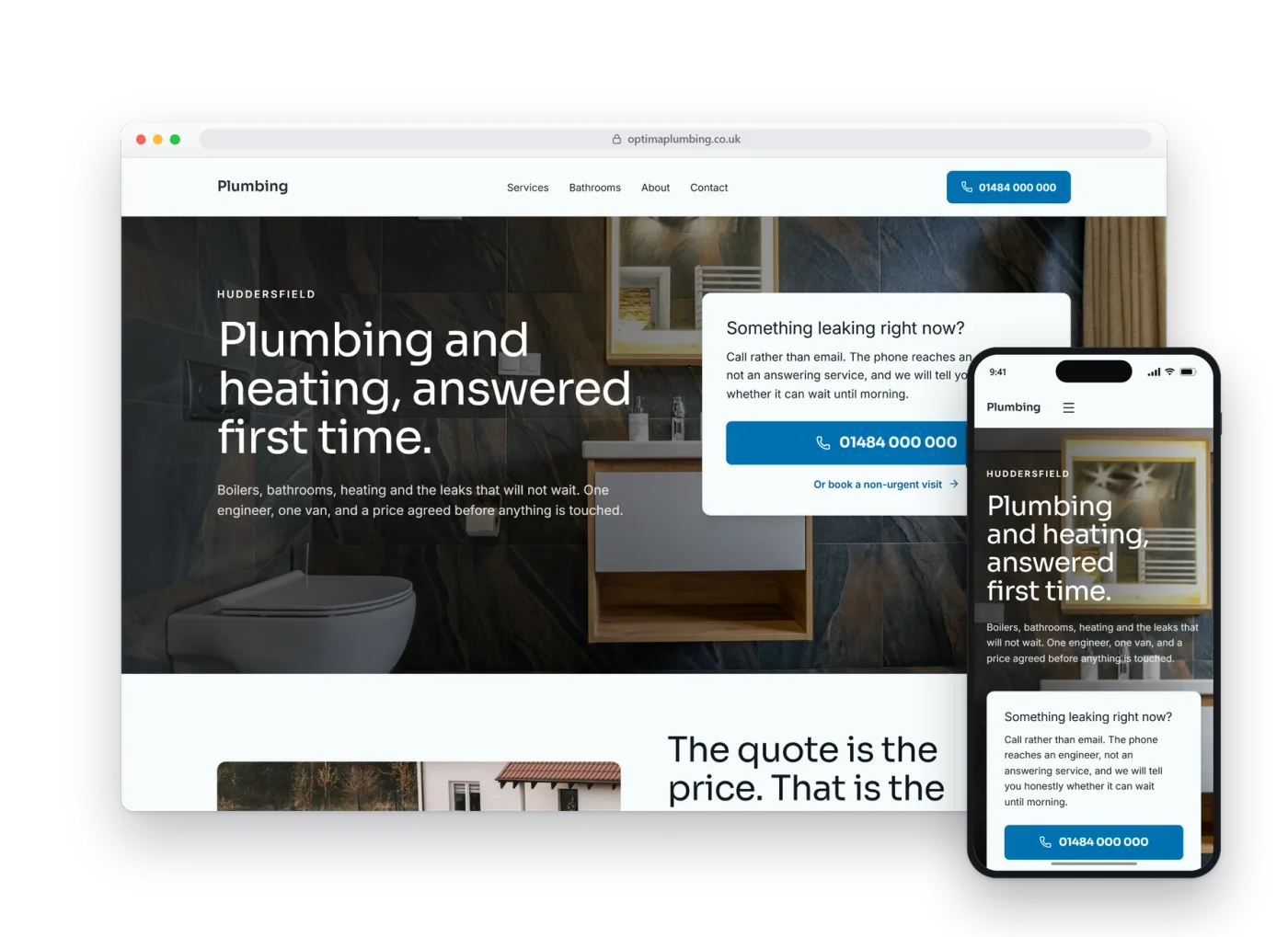
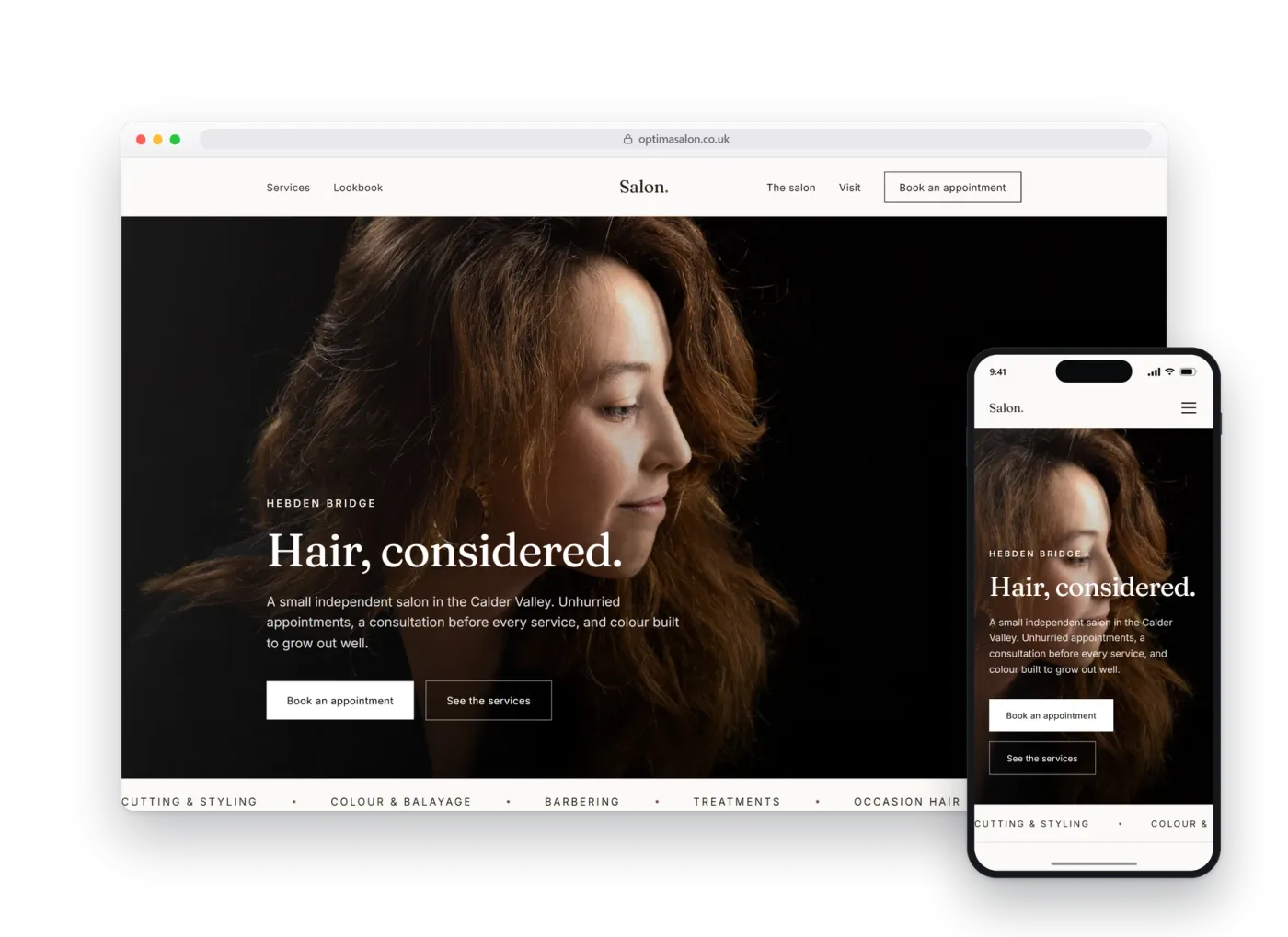
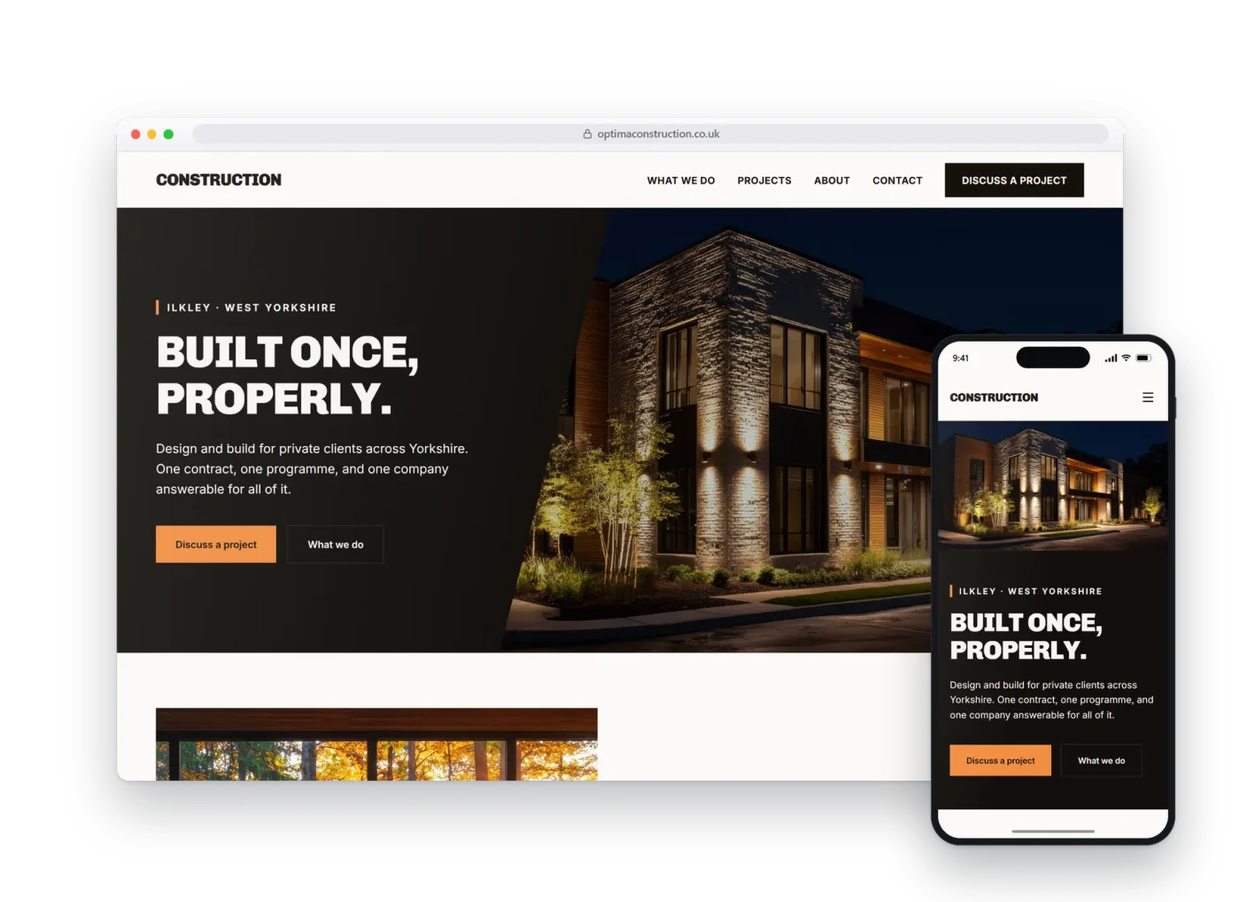
Accountants.
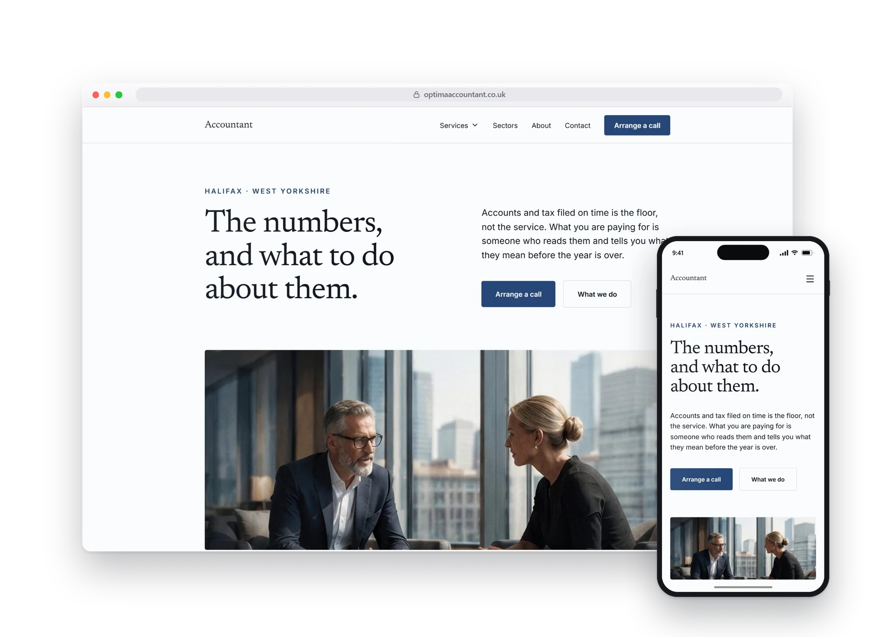
Built with strong trust signals, where the visitor is deciding whether these are people who have integrity and honesty as well as the skills. A real preview build, made before anybody had paid anything.
01The homepage
Most accountancy websites try to sound big. This one sounds certain.
A prospective client is not comparing feature lists. The website visitor is deciding whether your website conveys you have integrity, honesty and skills before they make contact.
No stock handshakes, no calculators, no gradient soup.
02What it does
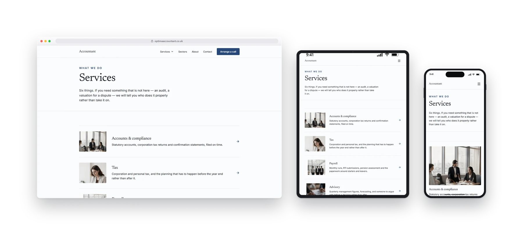
What you do, and who it is for.
Self assessment, limited company accounts, payroll and VAT, each written for the person who needs it rather than for another accountant.
- Service pages
- Enquiry form
- Local search
- Sector detail
- Deadlines and dates
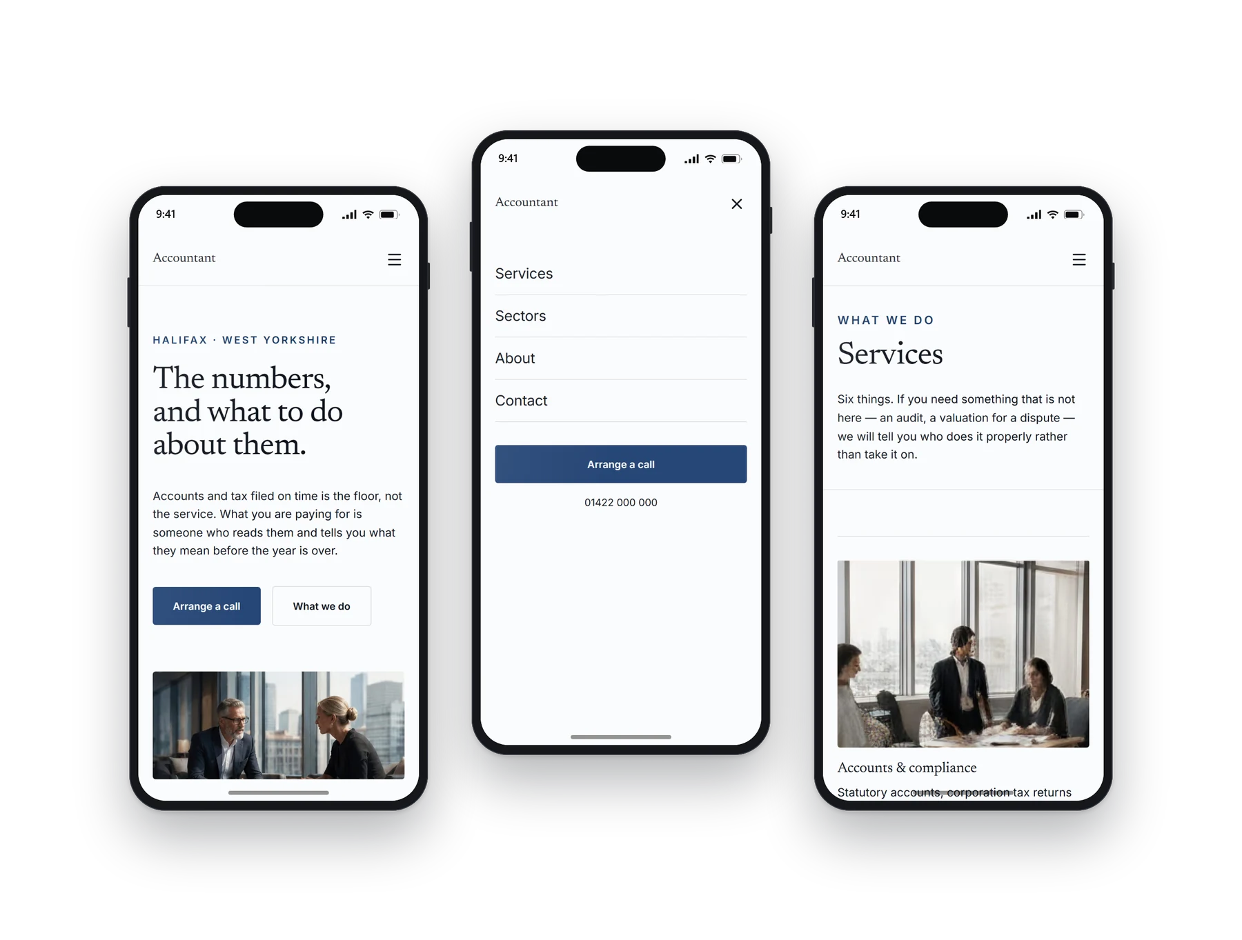
03On a phone
Most people will see this one.
Often read late in the evening by somebody who has just remembered a deadline. It stays calm, legible and quick, and the contact route is obvious.
04Other builds
Have a look at the rest.
Each design, layout and language pattern is sector-specific and tailored to each business. We do not simply provide the same template with the colours changed.