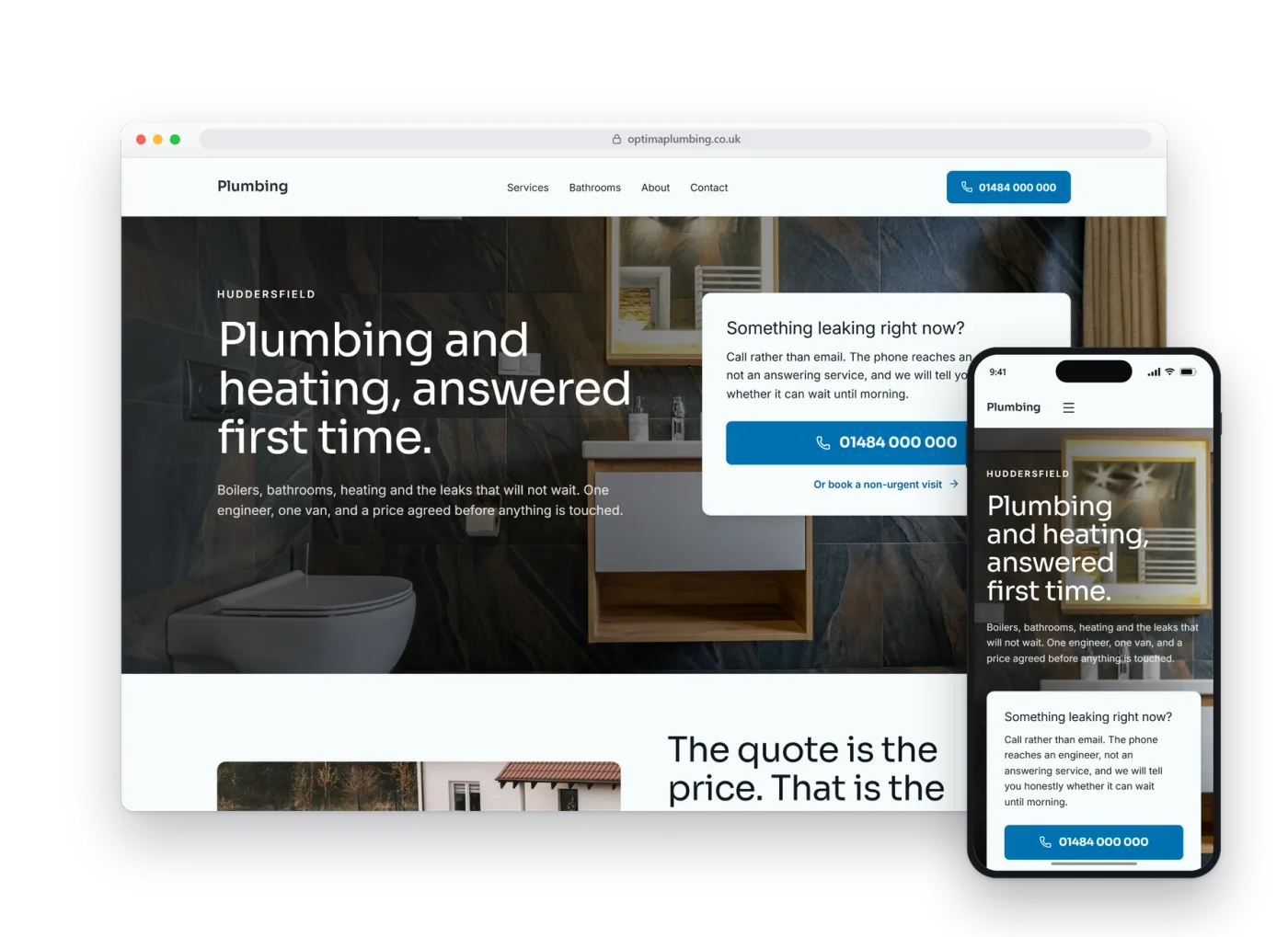
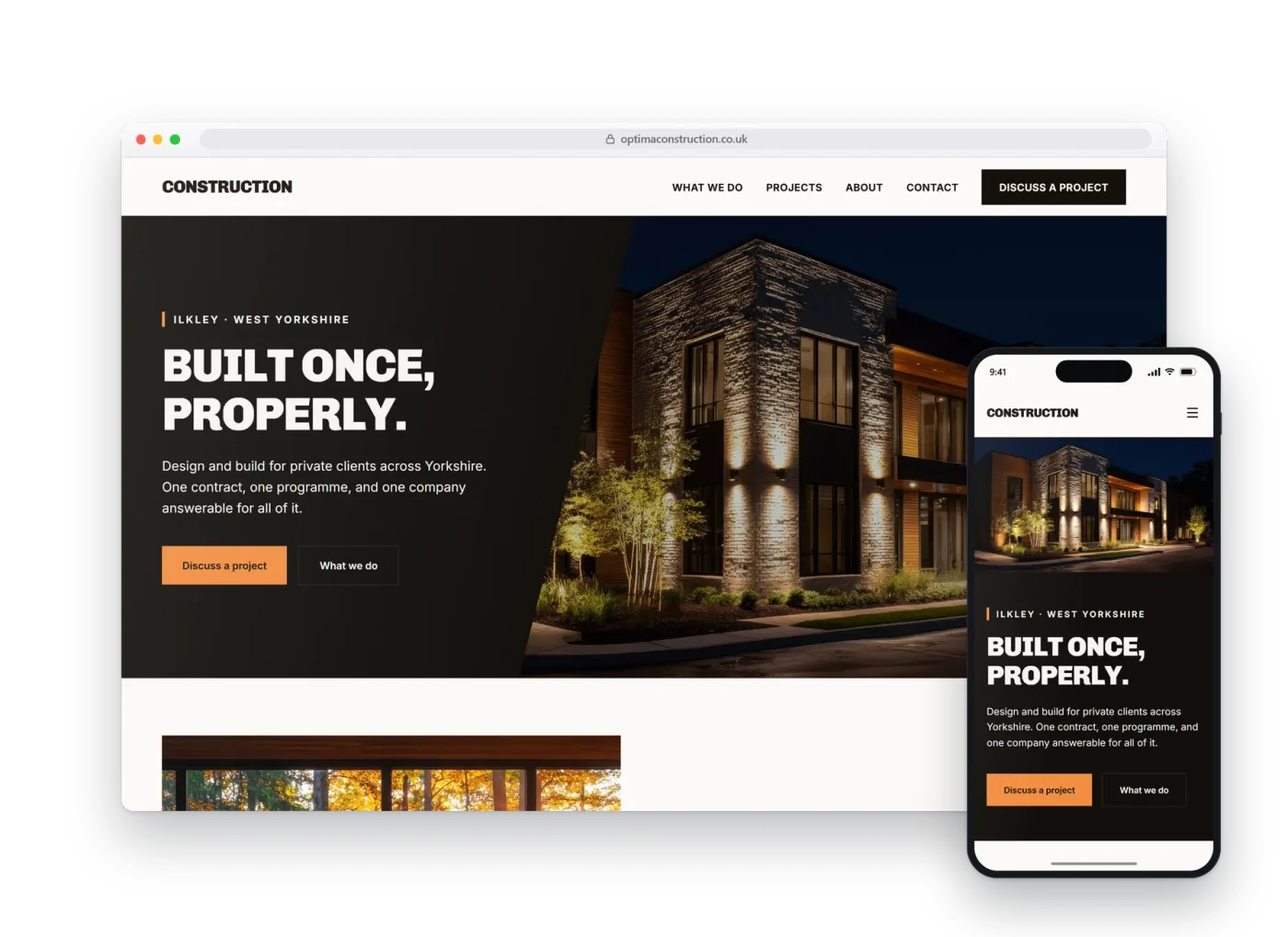
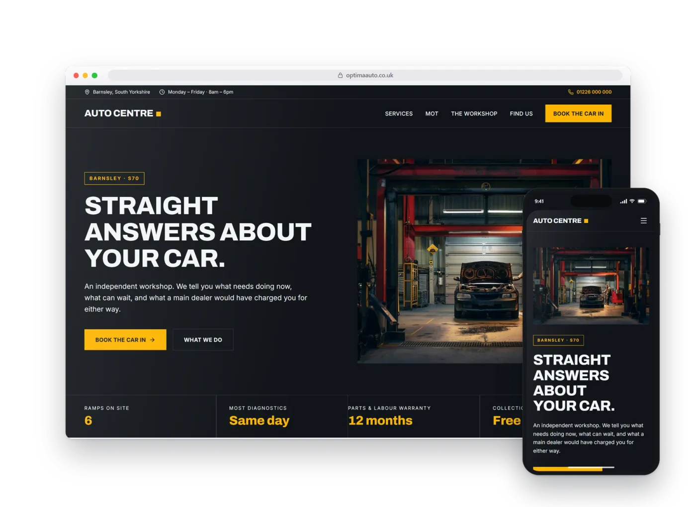
Salons.
Built for a trade that is judged on its work before anything else. This is a real preview build, made before anybody had paid anything.
01The homepage
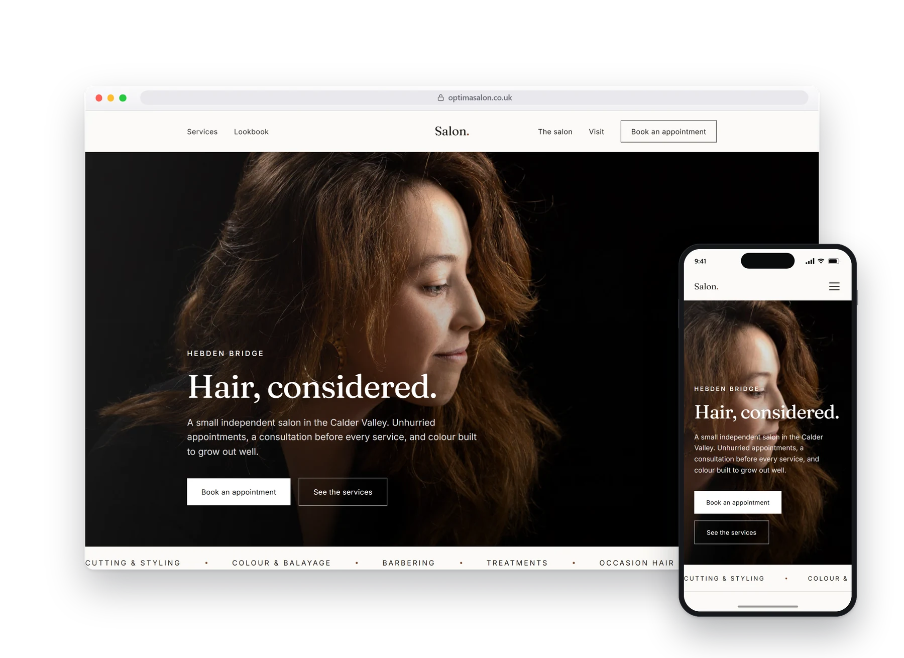
People choose a salon on the work, not the words.
Nobody reads a salon website. They scroll it, looking for hair that resembles theirs done well. So the photography runs the width of the screen and the copy gets out of its way.
The booking action follows you down the page and never becomes a pop-up.
02What it does
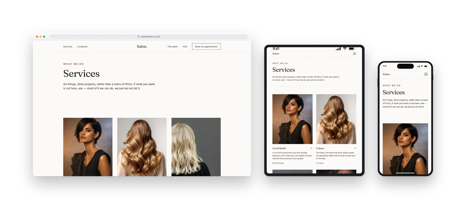
A price list that answers the question.
Cutting, colour and treatments with real prices against them, because the alternative is a phone call that starts with somebody apologising for asking.
- Booking
- Price list
- Photography
- Stylist profiles
- Opening hours
03On a phone
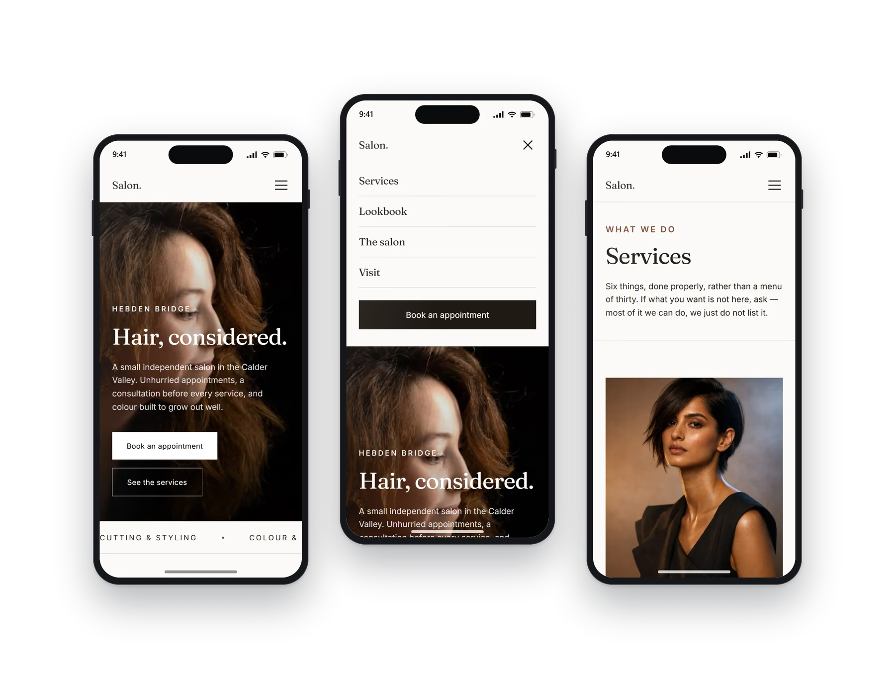
Most people will see this one.
Most salon bookings start on a phone, usually in the evening. The gallery stays swipeable, the prices stay legible, and booking is one tap from anywhere on the page.
04Other builds
Have a look at the rest.
Each design, layout and language pattern is sector-specific and tailored to each business. We do not simply provide the same template with the colours changed.