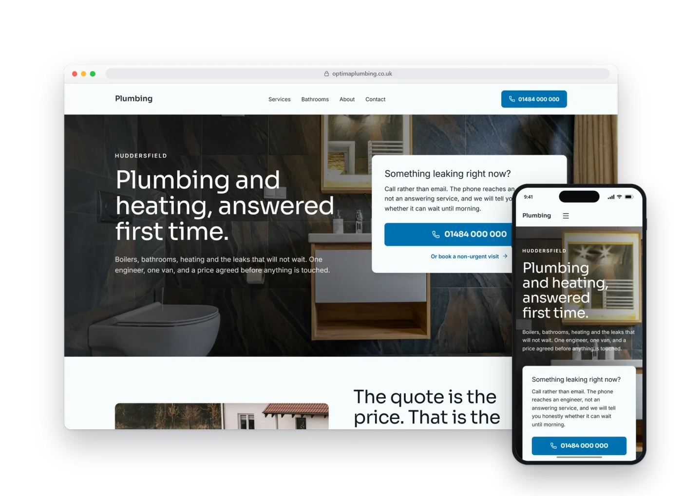
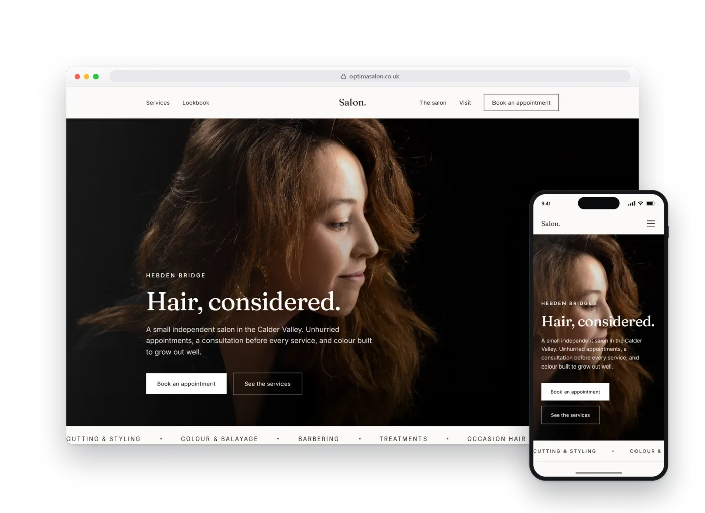
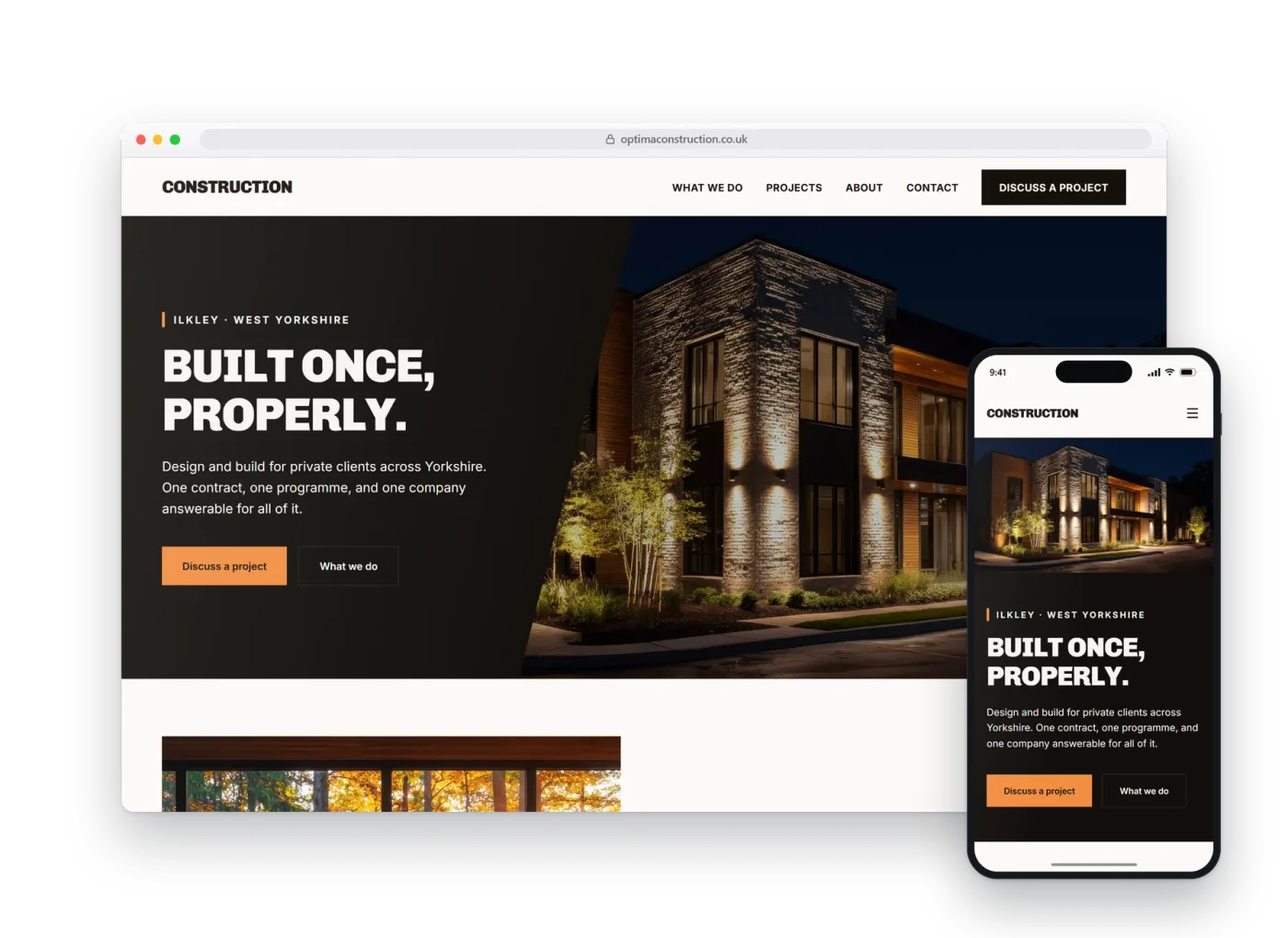
Physiotherapy.
Most people visit the site for need not desire, so the site's job is to feel acceptable and inviting. A real preview build, made before anybody had paid anything.
01The homepage
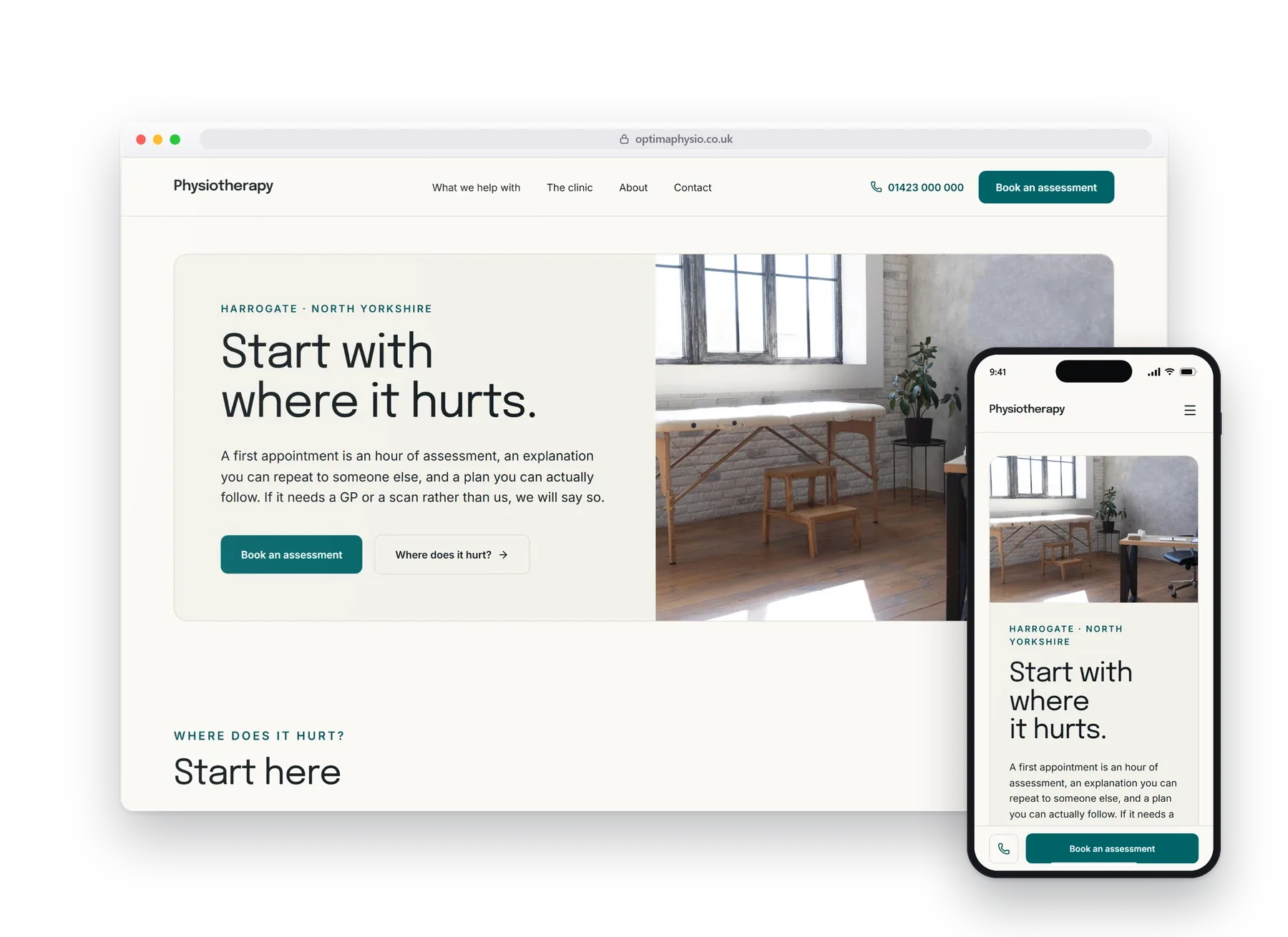
It opens with a question you can already answer: where does it hurt?
Somebody with a bad shoulder does not search for a musculoskeletal assessment, they search for the shoulder injury. So the page starts with the part of the body rather than the name of the service, and every way in is something the visitor already knows about themselves.
A booking dock that follows you down the page and stays put on a phone.
02What it does
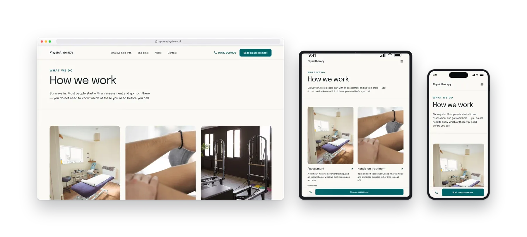
How we work, said plainly.
Assessment, manual therapy, rehabilitation, sports injuries and recovery after an operation, described as areas of work rather than conditions with a promised result.
- Book by area of pain
- Assessment
- Rehabilitation
- Booking
- Opening hours
03On a phone
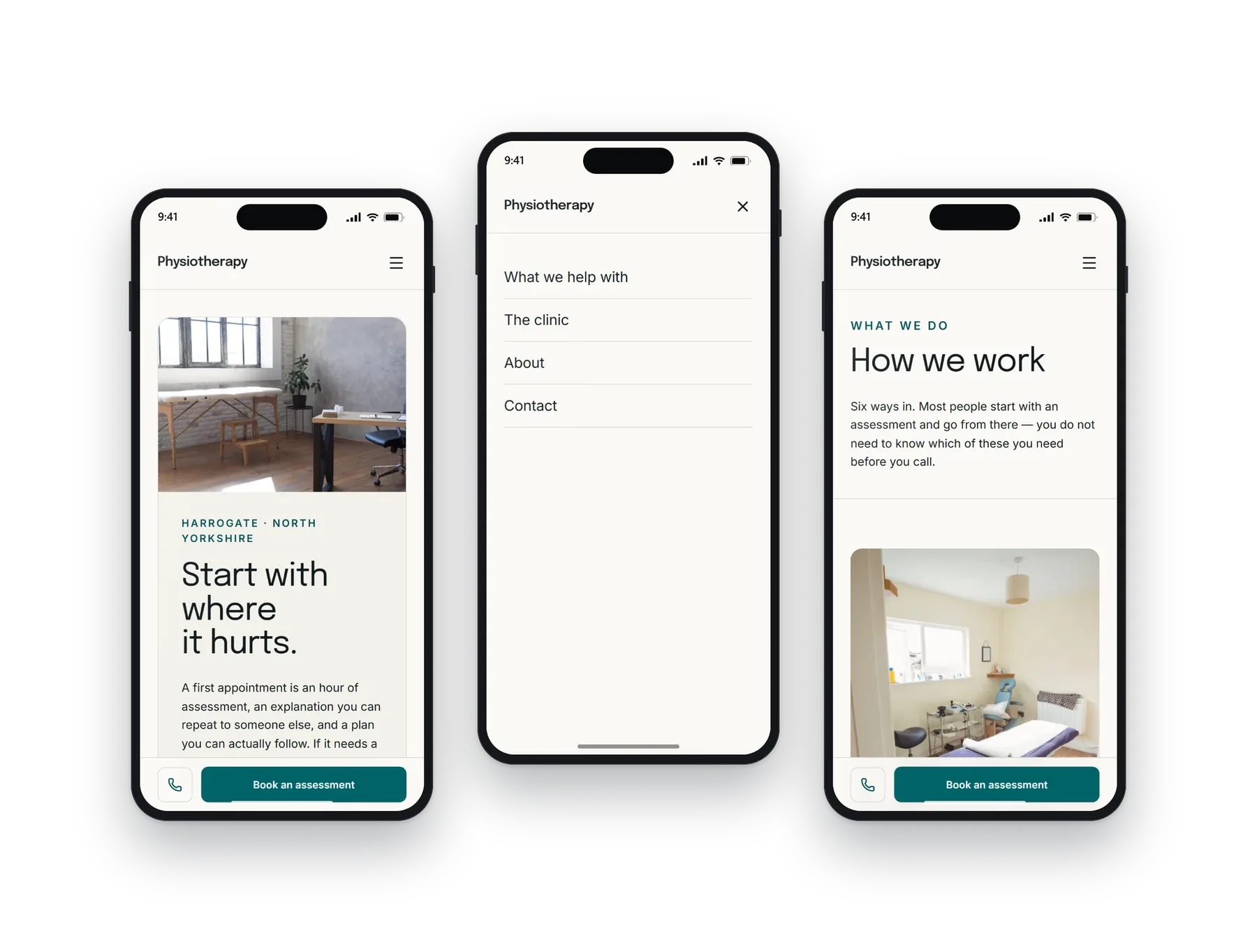
Most people will see this one.
Often read the evening after something gave way. It stays calm and legible, the areas of pain stack into a few taps, and the booking dock never leaves the bottom of the screen.
04Other builds
Have a look at the rest.
Each design, layout and language pattern is sector-specific and tailored to each business. We do not simply provide the same template with the colours changed.