Restaurants.
Built for a place people choose for one short menu that changes with the season. A real preview build, made before anybody had paid anything.
01The homepage
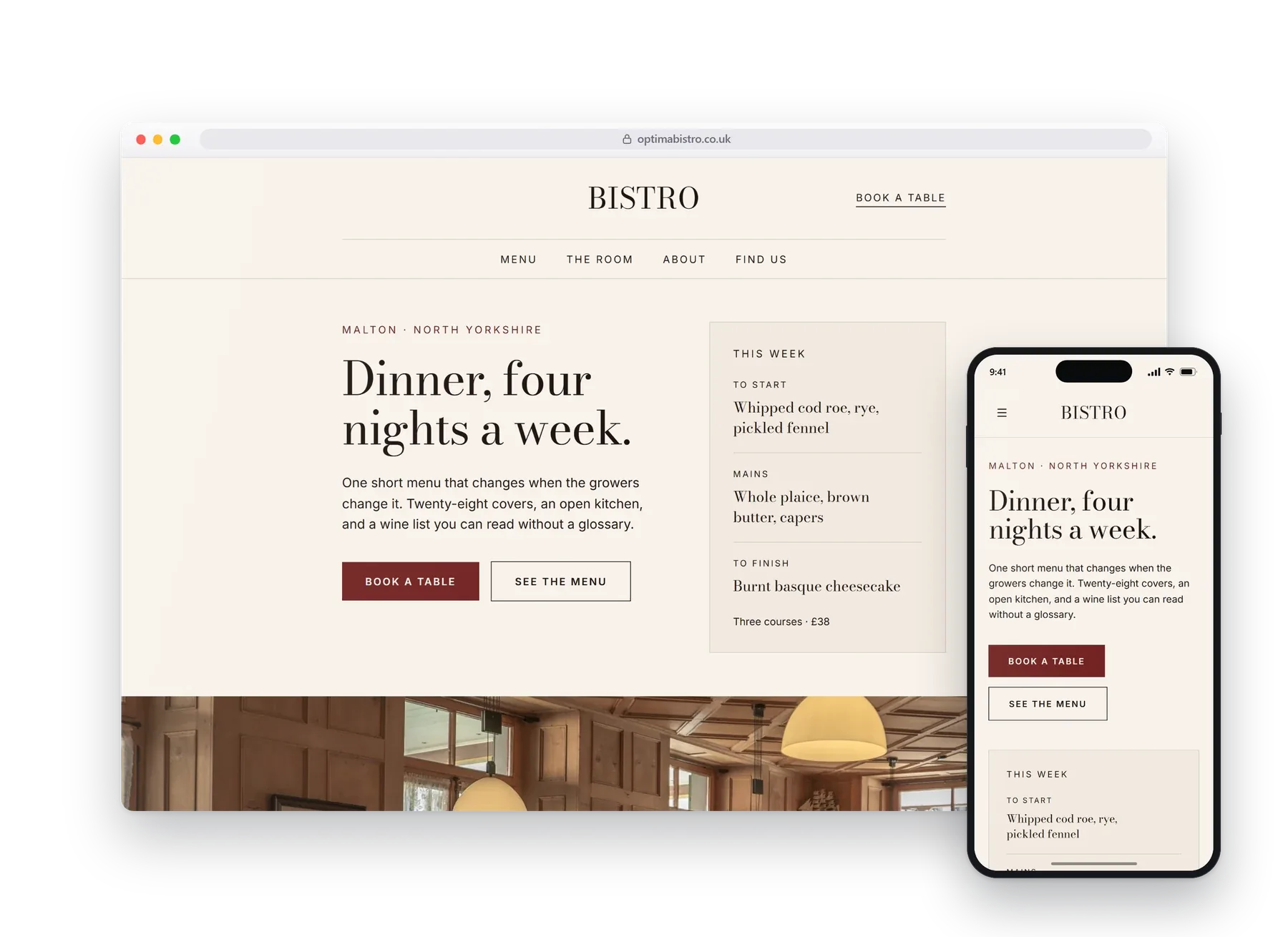
The menu is the website. Everything else gets out of its way.
Nobody books a table off a hero photograph of a plate. They want to know what is on tonight, whether they can get in, and whether it is their sort of place. So the menu sits on the first screen, set the way it would be on the table, and the room is left to speak for itself.
Set on cream paper in a proper typeface, not stacked over stock photography.
02What it does
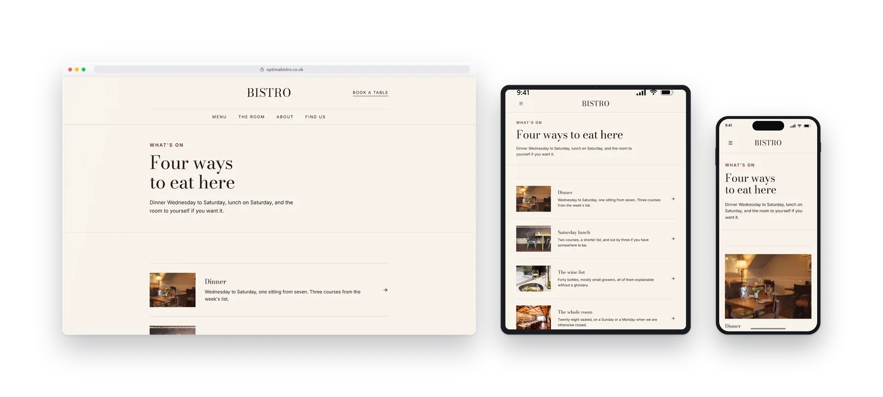
Four ways to eat here, four clear answers.
Dinner, Saturday lunch, the wine list and private hire, each on its own page rather than crammed into one, because those are the four things people actually arrive asking.
- Tonight's menu
- Table requests
- Wine list
- Private hire
- Opening hours
03On a phone
Most people will see this one.
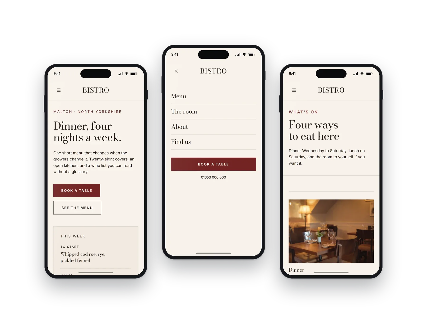
Most tables are booked from a phone, often at the table of somewhere else. The menu stays readable without pinching, and the request form is one tap from the foot of every course.
04Other builds
Have a look at the rest.
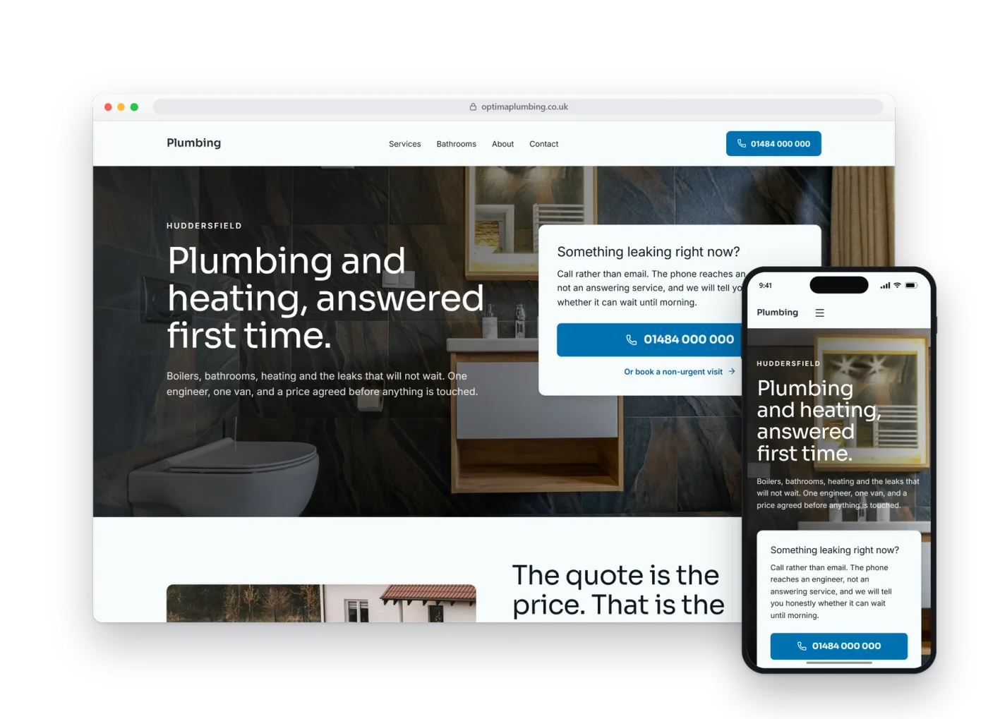
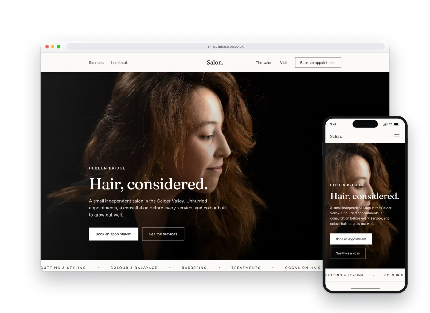
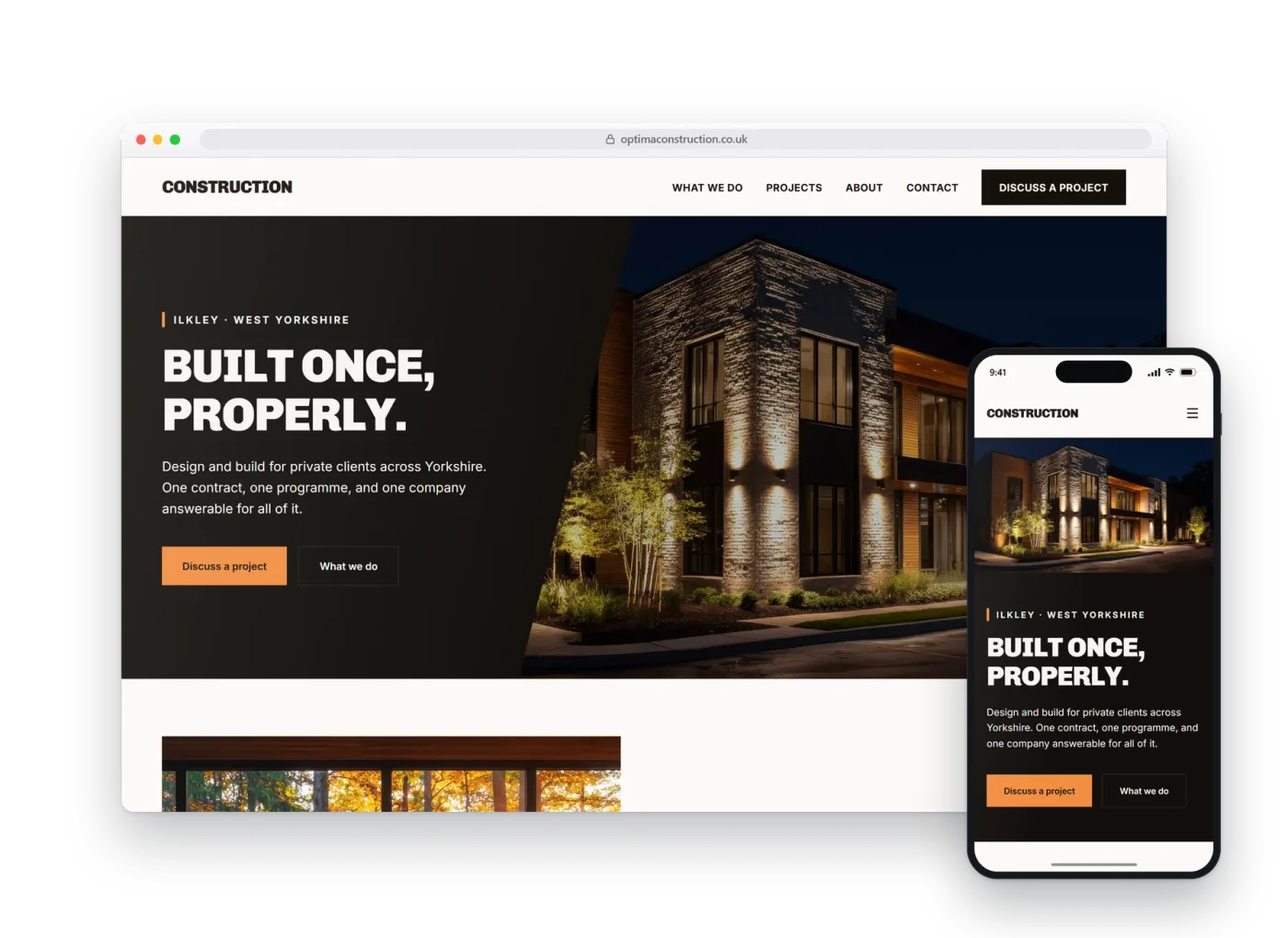
Each design, layout and language pattern is sector-specific and tailored to each business. We do not simply provide the same template with the colours changed.