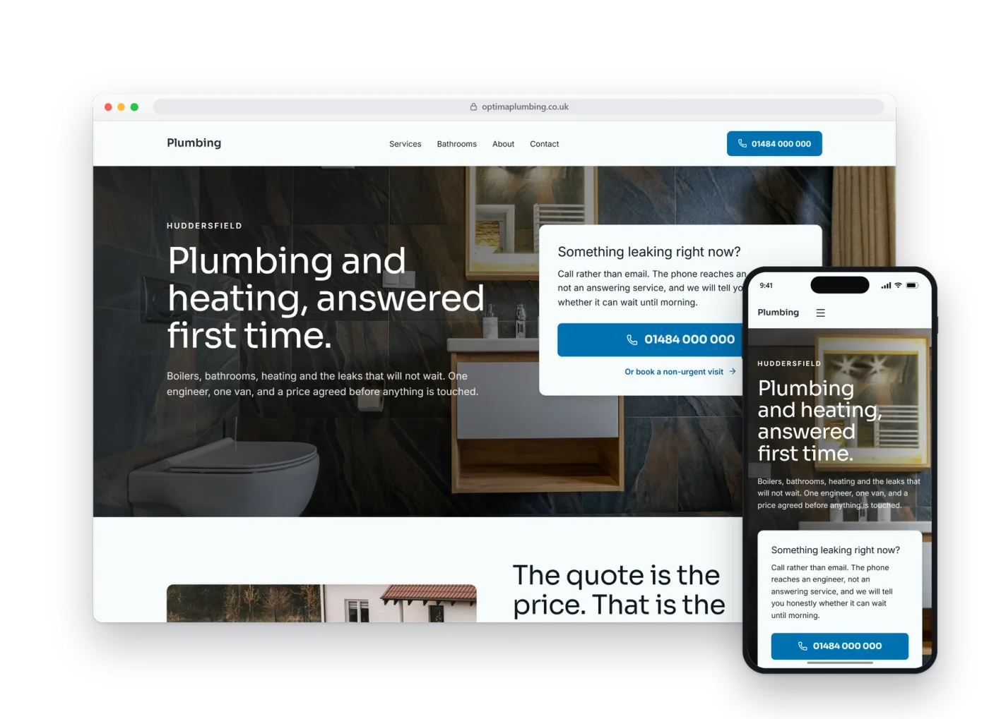
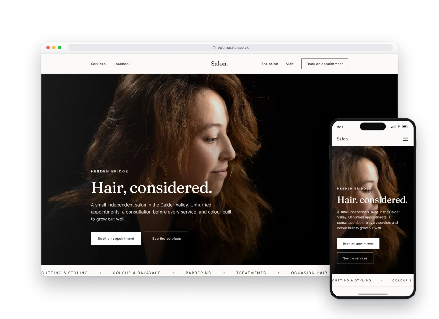
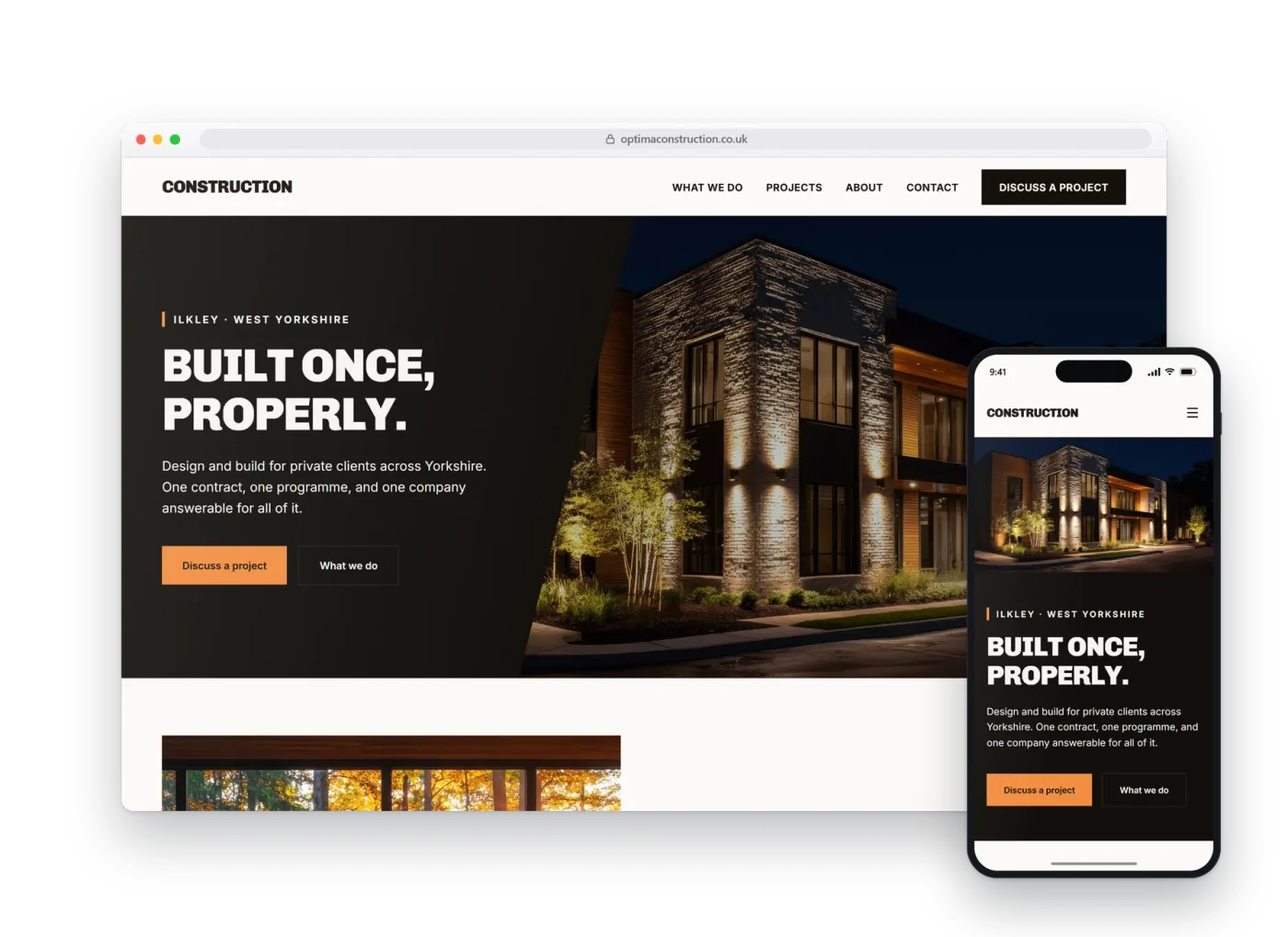
Gyms and studios.
Built for a coached studio where the thing people want to see is not a photo of the room but whether there is a session that fits their week. A real preview build, made before anybody had paid anything.
01The homepage
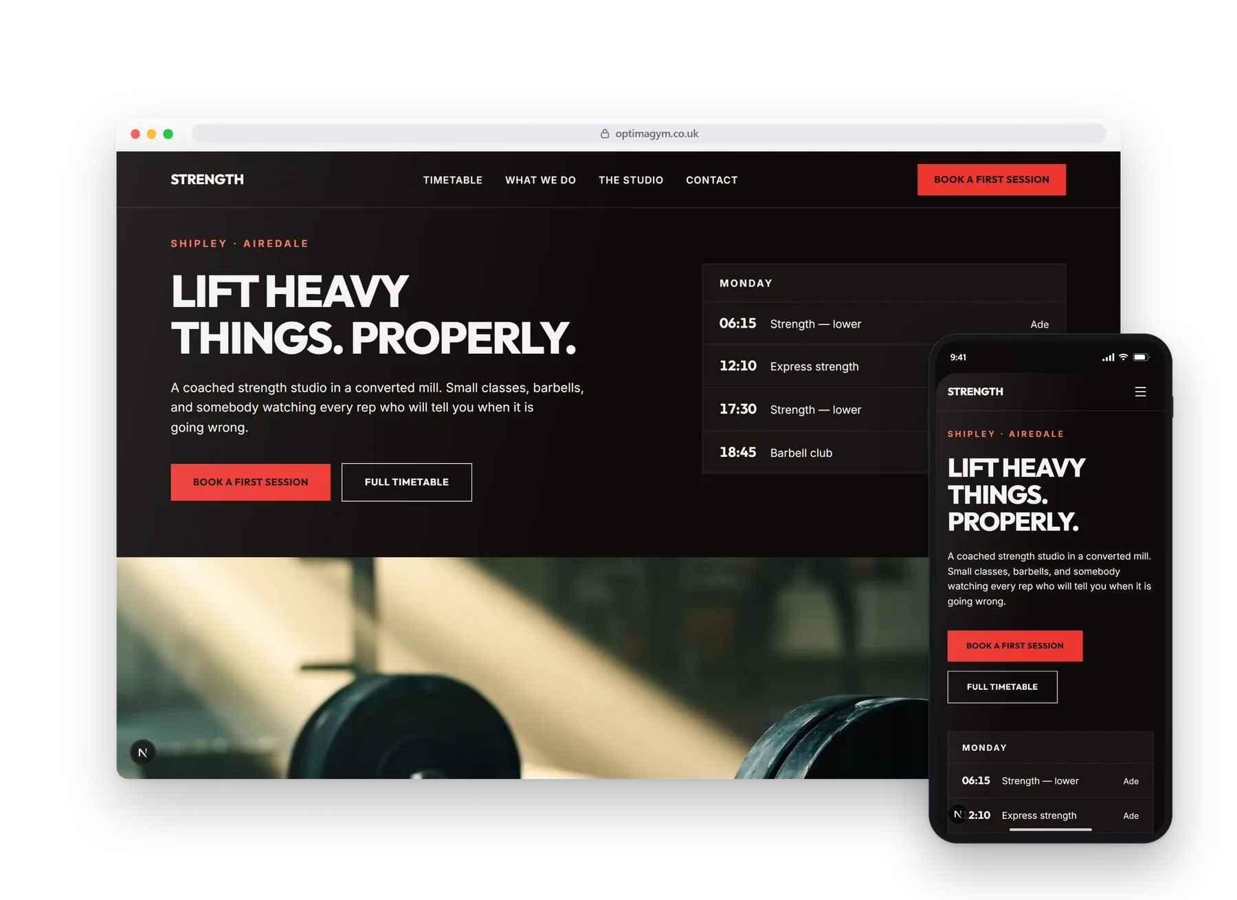
The first thing on the page is today's sessions, in time order.
Most studio websites hide the timetable behind an app download or a PDF, which is the one thing a prospective member actually came for. This one leads with it: today's classes at the top, the full week below, so the answer to whether you could fit it in is on the first screen.
The first dark design in the set, in heavy geometric type, with a nav that steps out of the way as you scroll.
02What it does
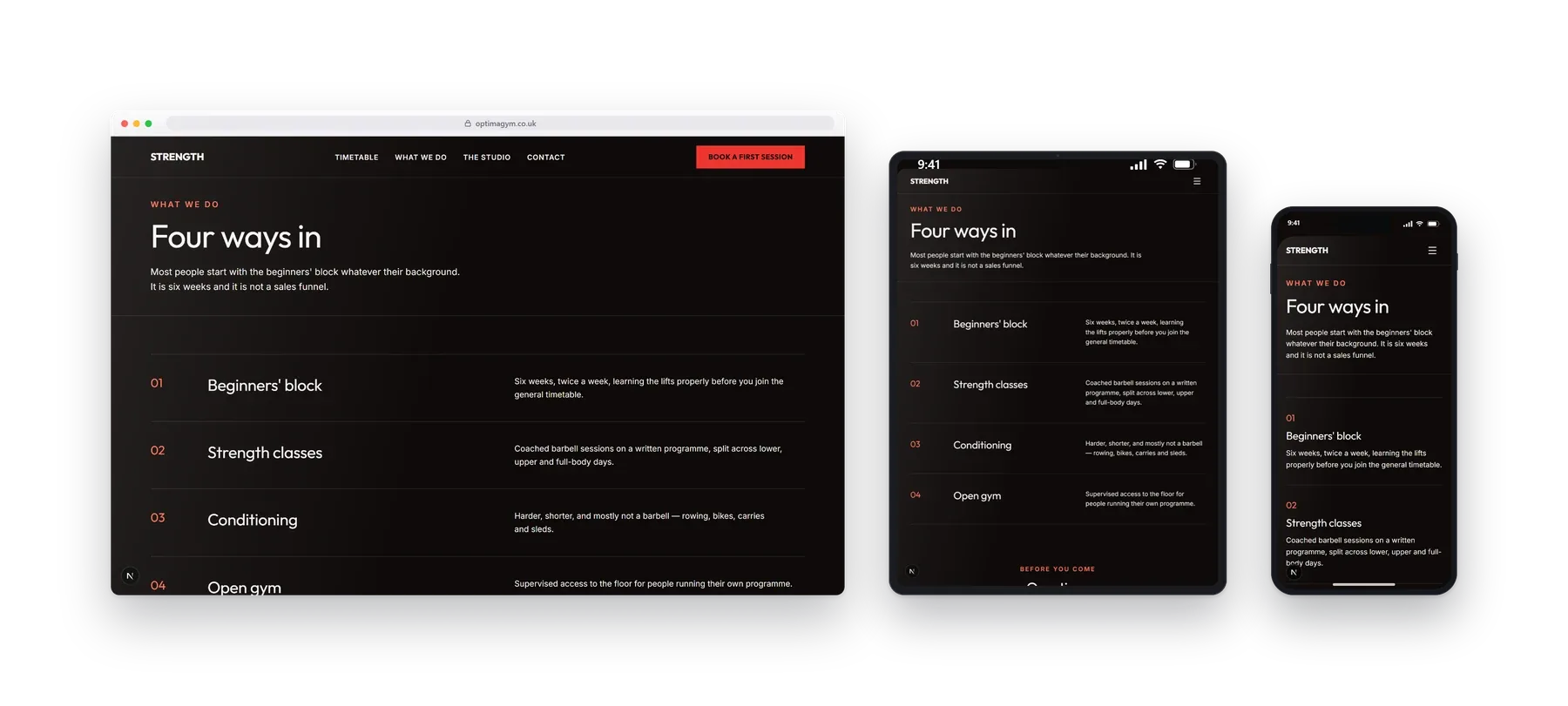
Four ways in, from a first barbell to open gym.
A beginners' block, coached strength classes, conditioning and open-gym access, each explained for the person deciding whether they would be out of their depth.
- Class timetable
- Beginners' block
- Open gym
- Coached sessions
- Opening hours
03On a phone
Most people will see this one.
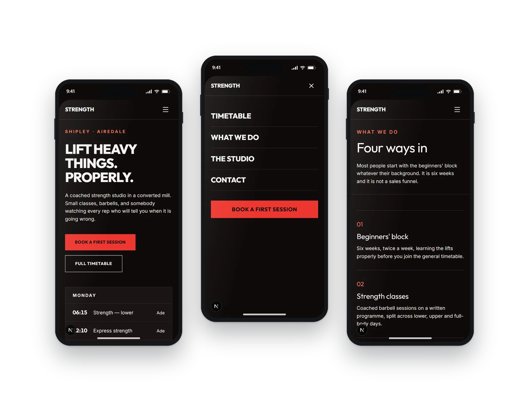
Checked on a phone between other things, usually in the evening. The timetable stays legible without pinching, and joining is one tap from anywhere on the page.
04Other builds
Have a look at the rest.
Each design, layout and language pattern is sector-specific and tailored to each business. We do not simply provide the same template with the colours changed.